Brushstroke city poster
An A4 brushstroke poster featuring a city’s landmarks.
Generate a photo like thisExplore the prompt- Recommended Workflows
- Gemini 3 Pro Image
- Recommended Aspect Ratio
- 3:4
- Reference Images Required
- No
01 / The recipe
Prompt variants
Use these as short alternate directions for Brushstroke city poster; each variant keeps the recipe recognizable while pushing a different outcome.
Brushstroke poster on A4 vertical canvas, elegant curved paint stroke from lower left to upper right. Inside the stroke only are 3D miniature iconic landmarks and architectural elements of {{CITY}}, selected by the model to best represent the city’s identity and culture. Include characteristic urban forms, famous buildings, and recognizable geography naturally associated with {{CITY}}. Impasto oil painting mixed with academic poster design, bas-relief texture, hyper-realistic miniatures, vibrant city-appropriate color palette inferred from {{CITY}}’s culture and environment, subtle material accents typical of the region, traditional and contemporary architecture blended. Minimalist top-down composition, large clean white space, pure white textured fine-art paper background. Master-level typography with precise grid and spacing, main title “{{CITY | UPPERCASE}}”, subtitle “{{COUNTRY | UPPERCASE}}”, secondary subtitle representing a well-known nickname or poetic description of {{CITY}} (inferred by the model). Refined serif decorative copy, small brand text “HummingBytes.com” top left and bottom right. Brush tip ends cleanly with no overflow, HDR, ultra-detail, 8K, print-ready A4 poster. 4K, 3:4 aspect ratio.
02 / Make it yours
A little direction goes a long way.
Create a Brushstroke city poster with a polished artistic treatment that preserves the subject while giving the image a clear illustrated style. No reference image is required, so the prompt carries the subject, setting, composition, and style constraints. This recipe is useful for profile pictures, editorial avatars, poster art, and stylized personal branding images.
Best for / not ideal for
Use this section to decide whether Brushstroke city poster is the right recipe before spending credits on variations.
Best for
- Brushstroke city poster concepts where the example image is close to the result you want.
- Visual directions built around an art-led portrait treatment that keeps likeness readable while making the style expressive.
- Compositions that benefit from a visual setting that reinforces the artwork while leaving the portrait easy to read.
- Fast testing with Gemini 3 Pro Image in 3:4.
Not ideal for
- Neutral photorealistic portraits with minimal visible styling.
- Technical diagrams, product packshots, or plain background documentation.
- Projects where every line must follow brand guidelines exactly.
- Subtle face cleanup that should still look like an untouched camera photo.
How to adapt the prompt
Keep the core idea of Brushstroke city poster, then change the details that control identity, style, color, background, and framing.
Subject and likeness
Style intensity
Color palette
Background simplicity
Composition and crop
Common fixes
If Brushstroke city poster is close but not usable yet, make one of these targeted prompt edits before changing everything.
Subject drift
Too busy or chaotic
Colors overpower the subject
Image feels flat
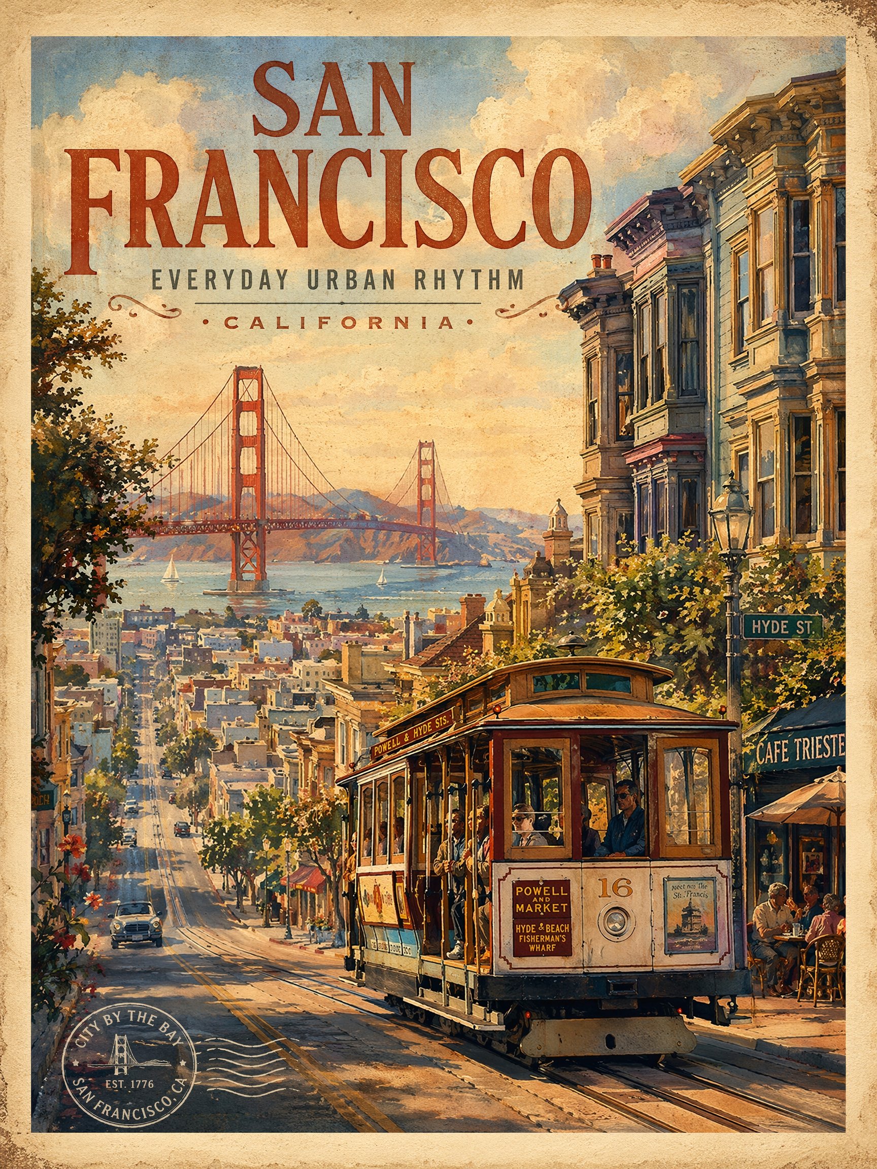
Vintage travel poster
Vintage travel poster creates destination-led visuals for travel campaigns, creator posts, and editorial trip concepts.
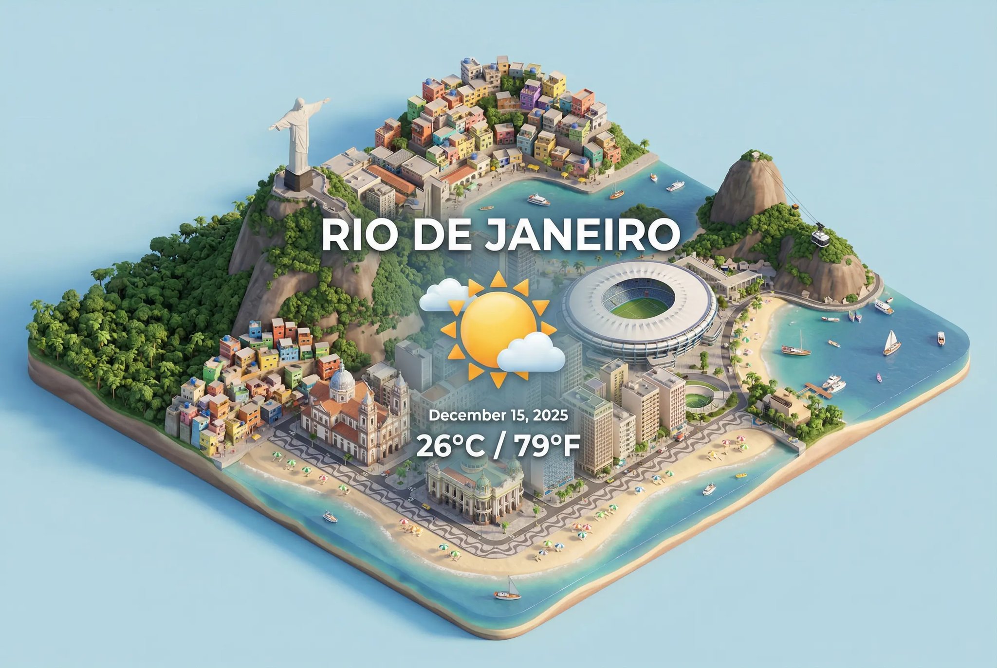
Isometric weather card
Isometric weather card creates a miniature or 3D-style scene with playful scale, shape, and detail.
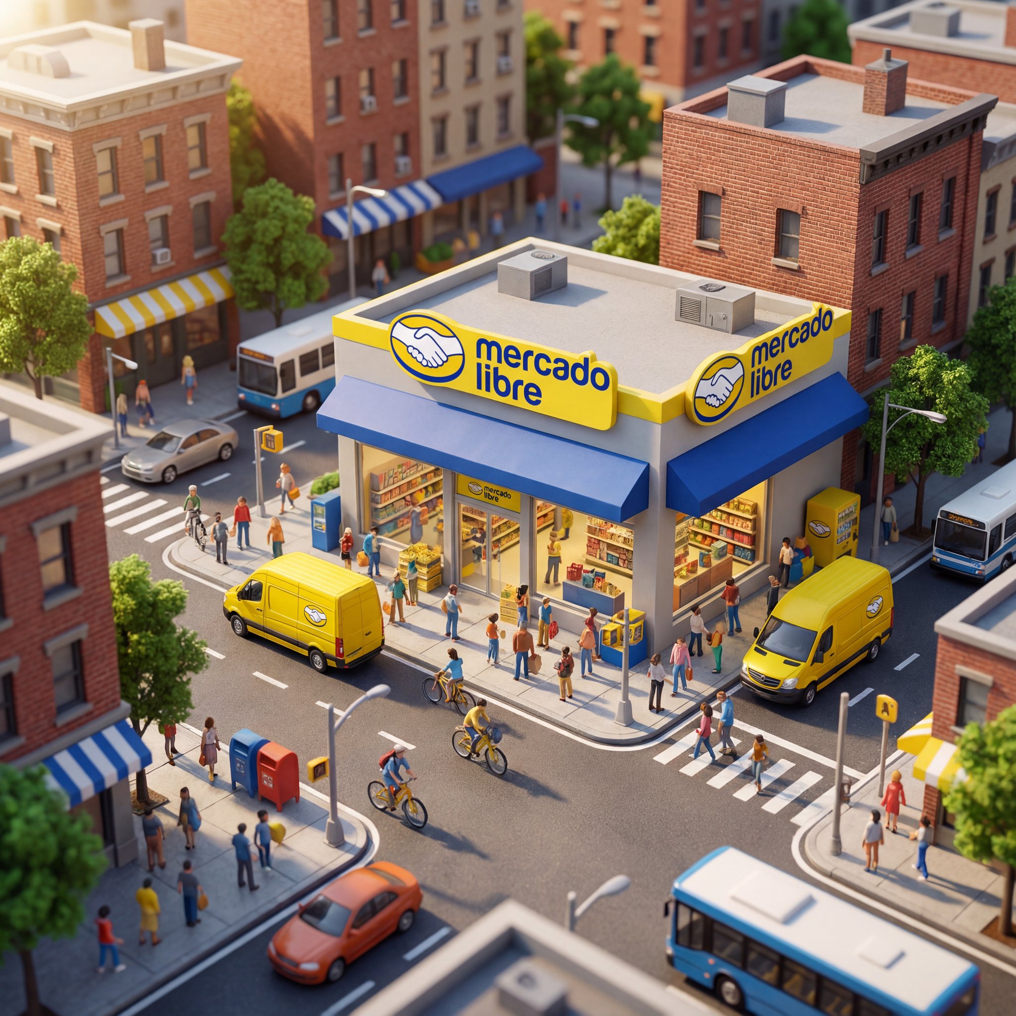
Miniature storefront city scene
Miniature storefront city scene creates a miniature or 3D-style scene with playful scale, shape, and detail.
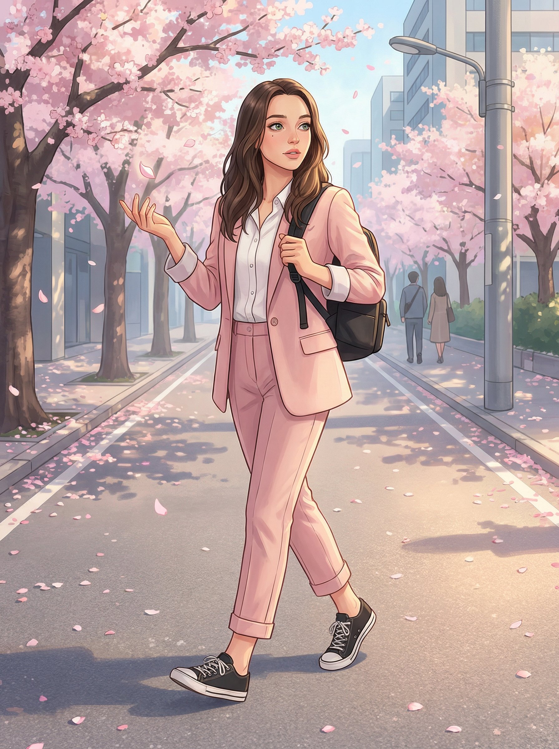
Cherry Blossom Anime Street Illustration
Cherry Blossom Anime Street Illustration uses a stylized art direction for portraits, avatars, posters, and expressive personal visuals.
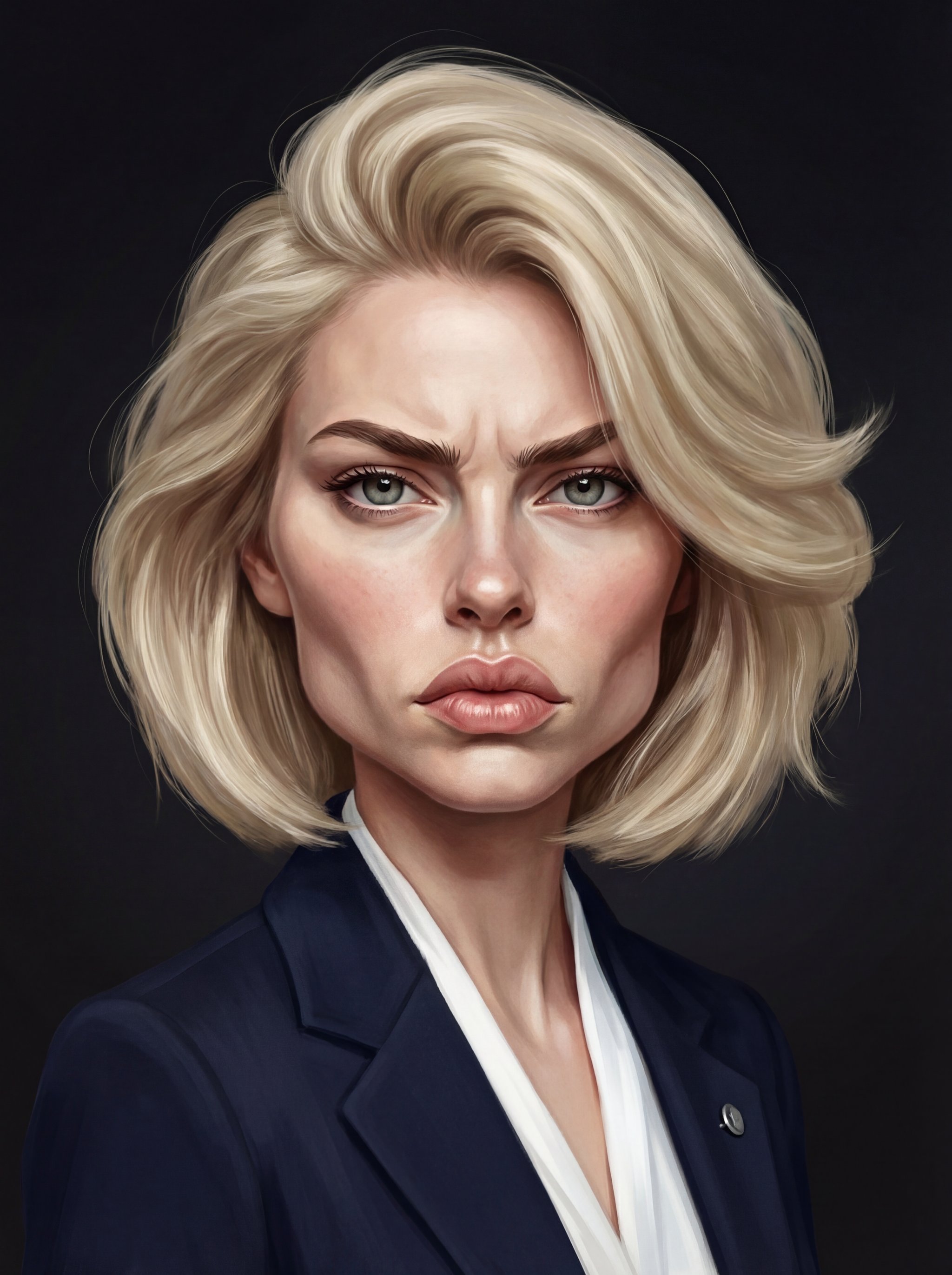
Hyperrealistic caricature portrait
Hyperrealistic caricature portrait uses a stylized art direction for portraits, avatars, posters, and expressive personal visuals.
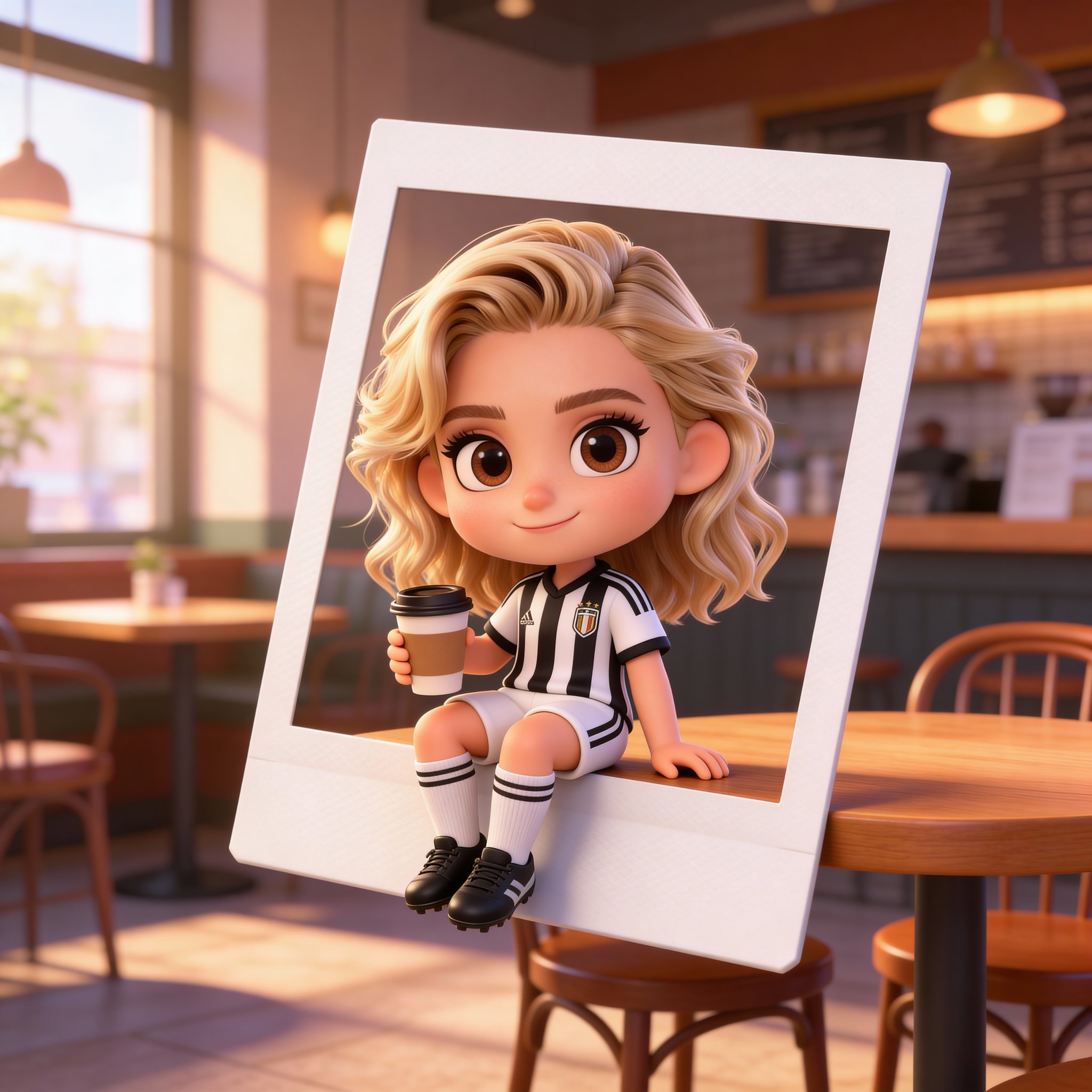
Chibi café character
Chibi café character creates a cinematic character concept with stronger costume, atmosphere, and story cues.
Make it yours
Create with this recipe.
Open this recipe in the generator and add your details.
Generate a photo like this