Cool-tone watercolor portrait
A hand-painted watercolor transformation with layered washes, paper texture, and contemplative mood.
Generate a photo like thisExplore the prompt- Recommended Workflows
- Seedream 4.5
- Recommended Aspect Ratio
- 3:4
- Reference Images Required
- 1 image
01 / The recipe
Prompt variants
Use these as short alternate directions for Cool-tone watercolor portrait; each variant keeps the recipe recognizable while pushing a different outcome.
Create a watercolor portrait using the subject from the uploaded reference image. Strictly preserve the subject’s facial features and identity exactly as they appear in the source photo. Pose & Composition: The subject has slightly raised shoulders and is positioned in a subtle three-quarter view facing right. The expression is calm and introspective. Place the dominant eye near the top-right third of the frame. Color Palette: Use a restrained, cool palette of Indigo, Prussian Blue, and Payne's Grey for the background and clothing. Use warm, transparent glazes of peach, cream, and umber for the skin tones. Technique & Style: Mimic authentic hand-painted watercolor techniques—transparent layered washes, soft wet-on-wet gradients, and natural backruns/blooms. Use fine dry-brush strokes and delicate lines for hair details and eyelashes. Apply sharp, defined accents to the eyes, nose, and lips, while allowing for 'lost edges' along the jawline and neck to blend into the background. Lighting & Background: Soft lighting from the left creates cool, desaturated shadows. The background is minimalist: airy blue-grey washes with artistic splatters and a few downward drips, rendered on a smooth hot-press watercolor paper texture. Finish: The image must have a matte finish with no photographic or lens effects, prioritizing a pure illustration and fine art painting aesthetic with a cool, contemplative mood.
02 / Make it yours
A little direction goes a long way.
Create a Cool-tone watercolor portrait with a portrait-focused composition that keeps the person recognizable and visually engaging. Start from the reference image so the subject, source structure, or key visual details stay anchored while the style changes. This recipe is useful for profile photos, social avatars, personal branding, character studies, and portrait variations.
Best for / not ideal for
Use this section to decide whether Cool-tone watercolor portrait is the right recipe before spending credits on variations.
Best for
- Cool-tone watercolor portrait concepts where the example image is close to the result you want.
- Visual directions built around a portrait-first look that preserves identity while changing the visual treatment.
- Compositions that benefit from a background that frames the person without competing with facial features.
- Fast testing with Seedream 4.5 in 3:4.
Not ideal for
- Formal ID photos, passport photos, or strict corporate headshots.
- Subtle retouching where the original photo should barely change.
- Product-only images with no person or character as the subject.
- Cases where exact wardrobe, pose, and lighting must be legally or medically precise.
How to adapt the prompt
Keep the core idea of Cool-tone watercolor portrait, then change the details that control identity, style, color, background, and framing.
Subject and likeness
Style intensity
Color palette
Background simplicity
Composition and crop
Common fixes
If Cool-tone watercolor portrait is close but not usable yet, make one of these targeted prompt edits before changing everything.
Subject drift
Too busy or chaotic
Colors overpower the subject
Image feels flat
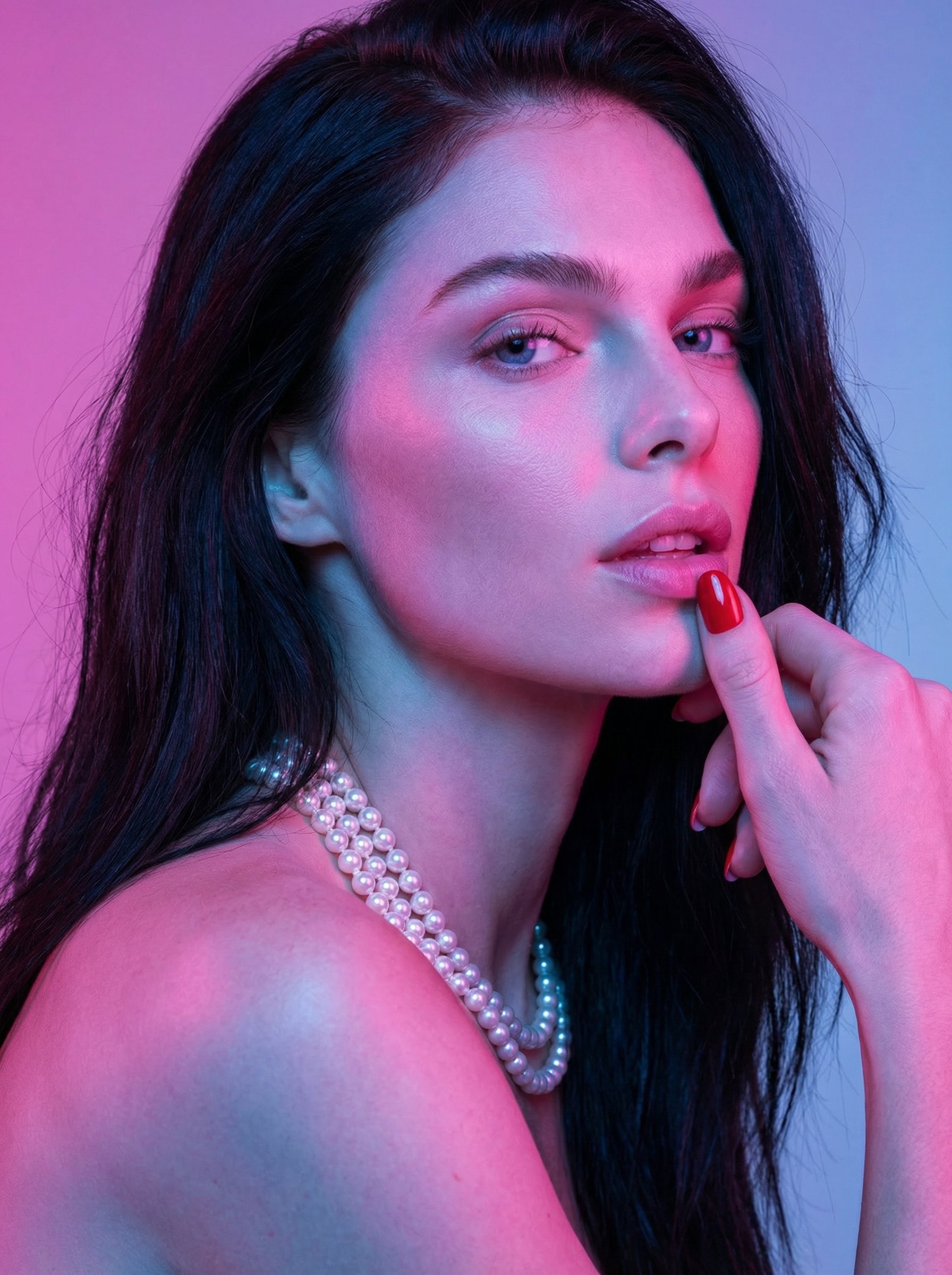
Neon Pearl Cinematic Beauty Portrait
Neon Pearl Cinematic Beauty Portrait explores a fashion or editorial portrait direction with stronger styling and campaign-ready composition.
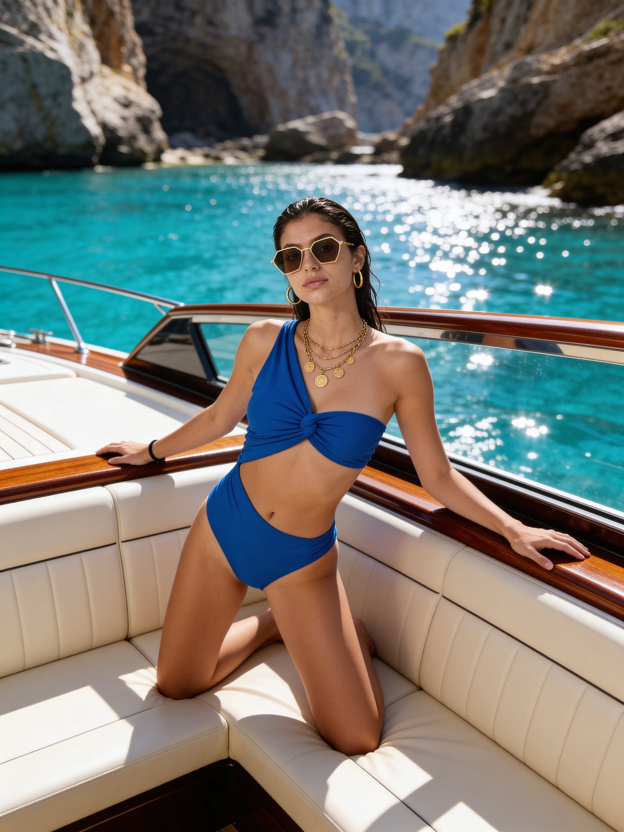
Luxury speedboat coastal portrait
Luxury speedboat coastal portrait focuses on a recognizable portrait result with clear subject presence and useful creative variations.
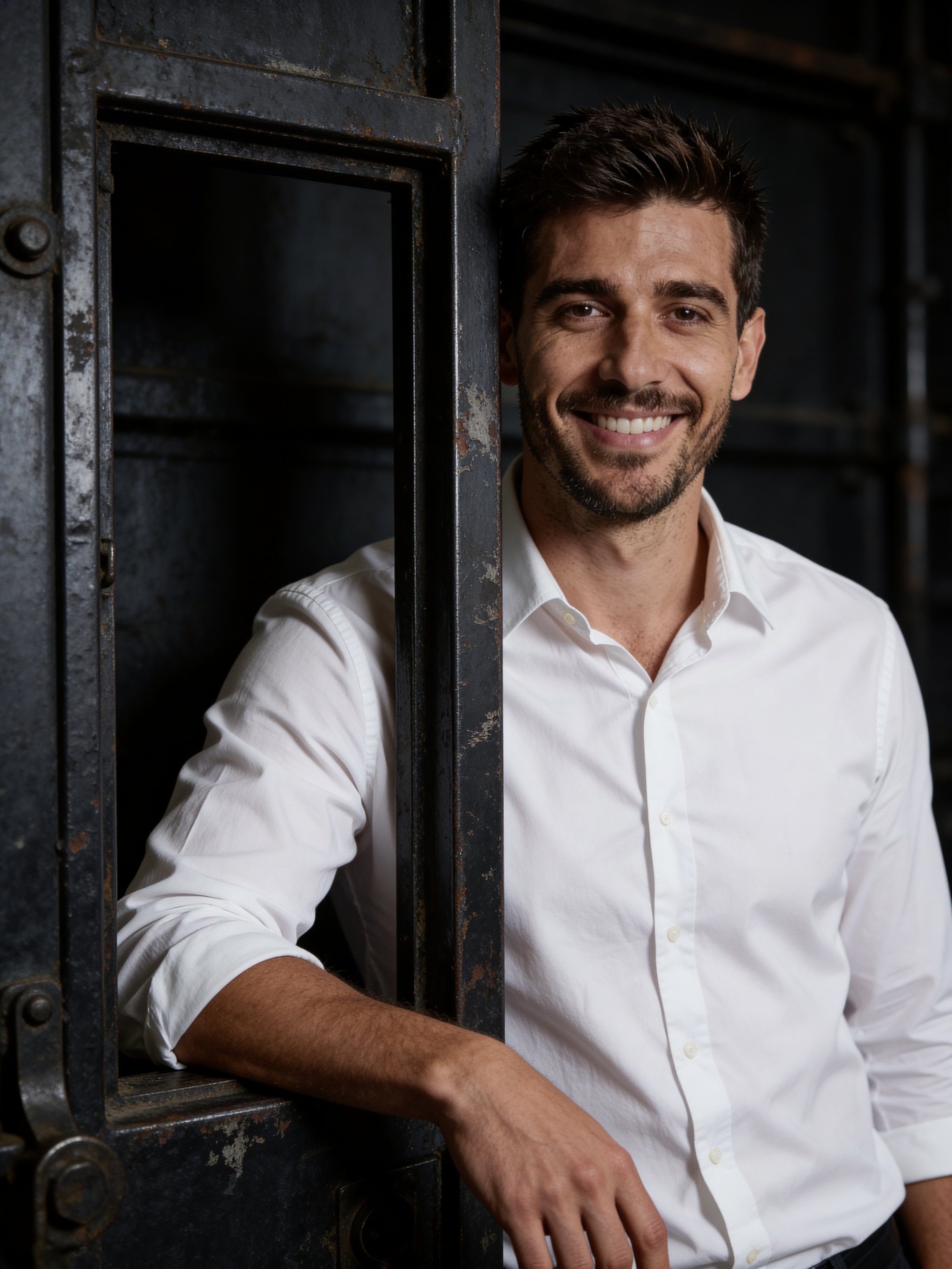
Industrial door cinematic portrait
Industrial door cinematic portrait focuses on a recognizable portrait result with clear subject presence and useful creative variations.
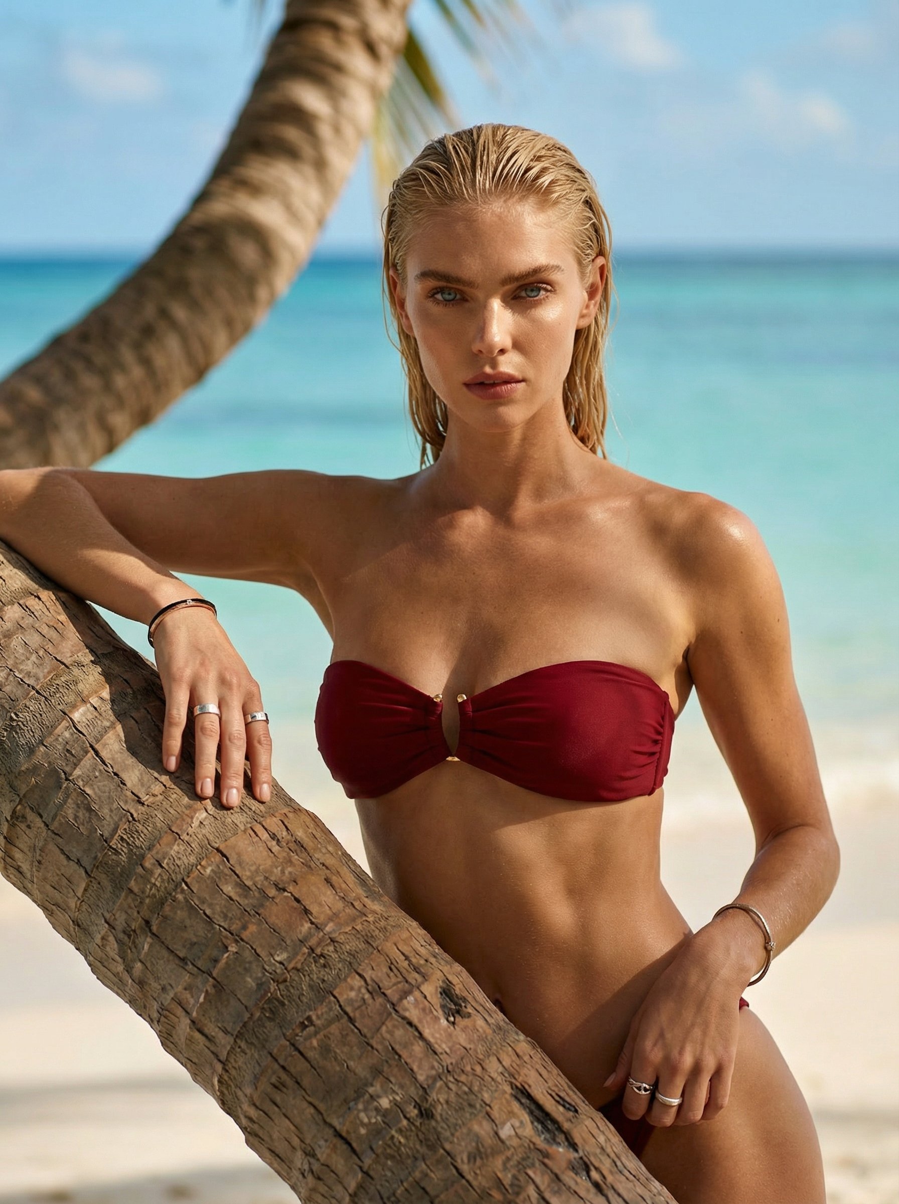
Tropical palm beach lifestyle portrait
Tropical palm beach lifestyle portrait explores a fashion or editorial portrait direction with stronger styling and campaign-ready composition.
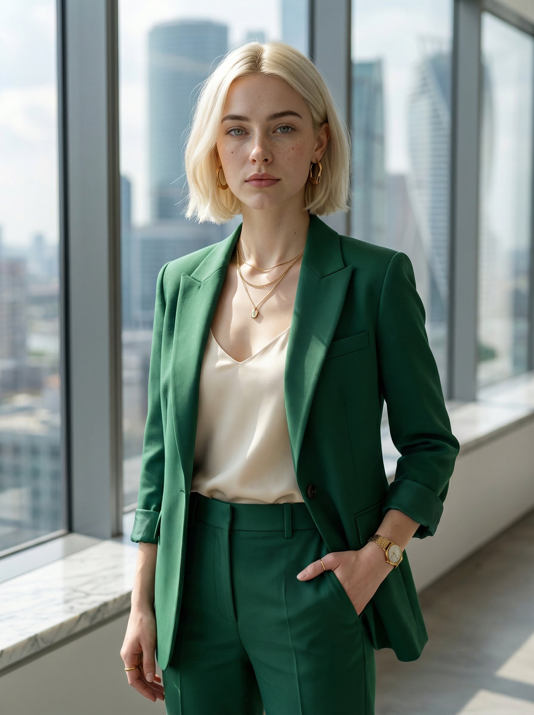
Emerald suit corporate office portrait
Emerald suit corporate office portrait creates a polished professional portrait for profiles, press kits, team pages, and business use.
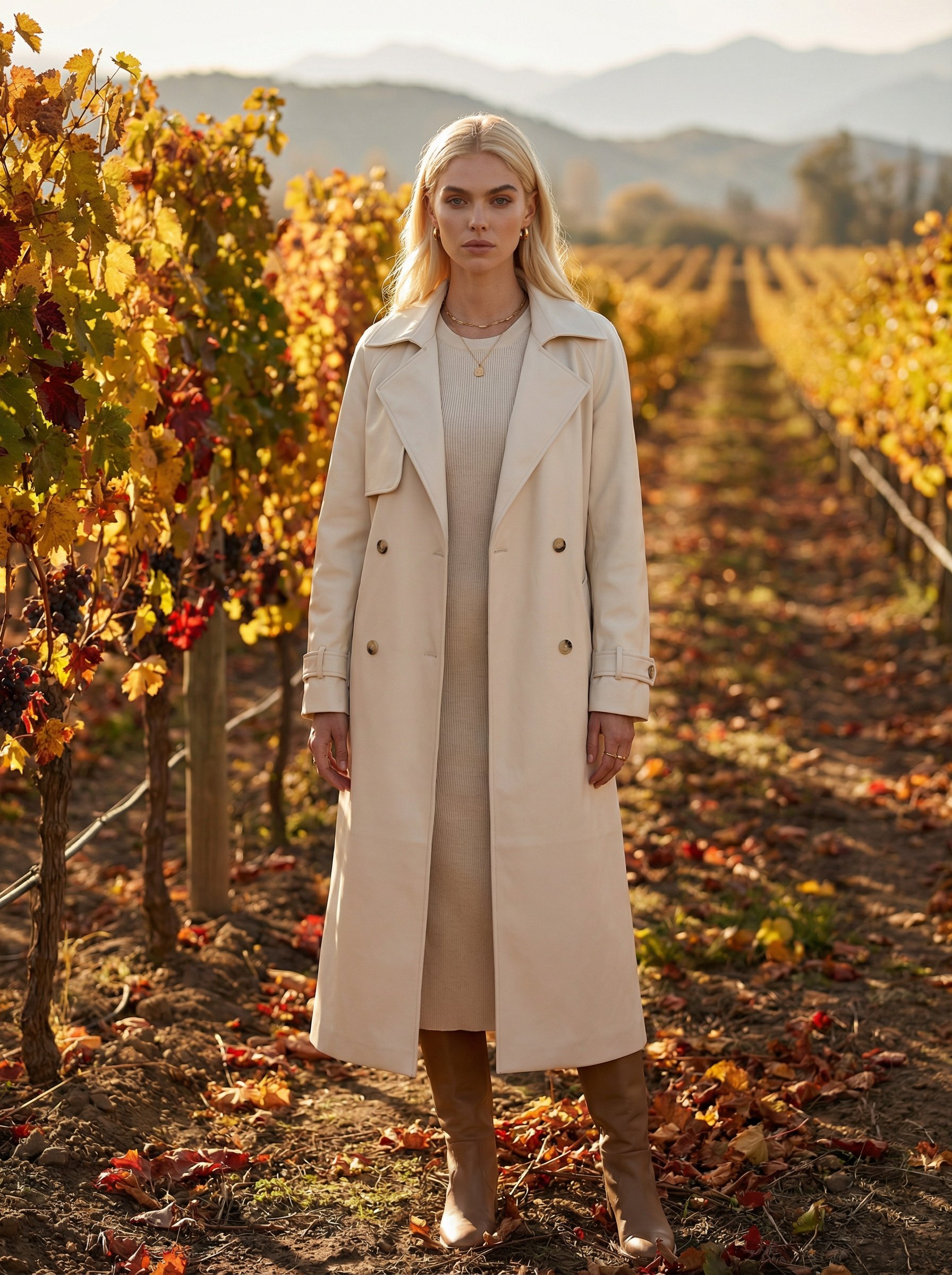
Chilean vineyard autumn lifestyle portrait
Chilean vineyard autumn lifestyle portrait creates destination-led visuals for travel campaigns, creator posts, and editorial trip concepts.
Make it yours
Create with this recipe.
Open this recipe in the generator and add your details.
Generate a photo like this