Perfume product photography
A cinematic, hyper-real product shot with glass refraction and caustics.
Generate a photo like thisExplore the prompt- Recommended Workflows
- Gemini 3 Pro Image
- Reference Images Required
- No
01 / The recipe
Prompt variants
Use these as short alternate directions for Perfume product photography; each variant keeps the recipe recognizable while pushing a different outcome.
A hyper-realistic commercial CGI product shot of a luxury perfume bottle named '{{productName}}'. The bottle features a heavy, geometric asymmetrical design made of faceted hexagonal crystal glass with thick walls and a weighty base, filled with pale champagne pink liquid. It is topped with a brushed brass architectural cylinder cap featuring a marble texture insert. The brand name '{{brandMark}}' is applied via gold foil stamping directly onto the glass. The bottle rests on an obsidian black reflective surface covered in shallow water, with subtle ripples and a single white orchid flower floating nearby. The background is a minimalist abstract nature scene with a dramatic horizon, where moody clouds part to reveal a warm sunrise. The lighting is a natural cinematic backlight, creating golden rim highlights on the bottle and long, soft shadows. Rendered in an Octane/Redshift style with 8K resolution, ray-traced caustics, and physically accurate glass refraction. The image features a cinematic teal and orange color grade, high contrast, and a subtle anamorphic lens flare. Low angle, 50mm anamorphic lens, f/2.8 aperture with sharp focus on the text and smooth bokeh. 16:9 aspect ratio.
02 / Make it yours
A little direction goes a long way.
Create a Perfume product photography with a product-first composition that keeps the item clear, attractive, and campaign-ready. No reference image is required, so the prompt carries the subject, setting, composition, and style constraints. This recipe is useful for product hero shots, ecommerce visuals, ad concepts, catalog variations, and brand campaign images.
Best for / not ideal for
Use this section to decide whether Perfume product photography is the right recipe before spending credits on variations.
Best for
- Perfume product photography concepts where the example image is close to the result you want.
- Visual directions built around a product-focused look that keeps the item recognizable and commercially usable.
- Compositions that benefit from a clean environment that gives the product context and visual priority.
- Fast testing with Gemini 3 Pro Image in the recipe default canvas.
Not ideal for
- Strict ecommerce packshots that need measured dimensions and compliance labels.
- Unstyled catalog images on a pure white background.
- Scenes where the product must not be reinterpreted creatively.
- Final production artwork that requires exact typography or ingredient text.
How to adapt the prompt
Keep the core idea of Perfume product photography, then change the details that control identity, style, color, background, and framing.
Subject and likeness
Style intensity
Color palette
Background simplicity
Composition and crop
Common fixes
If Perfume product photography is close but not usable yet, make one of these targeted prompt edits before changing everything.
Subject drift
Too busy or chaotic
Colors overpower the subject
Image feels flat
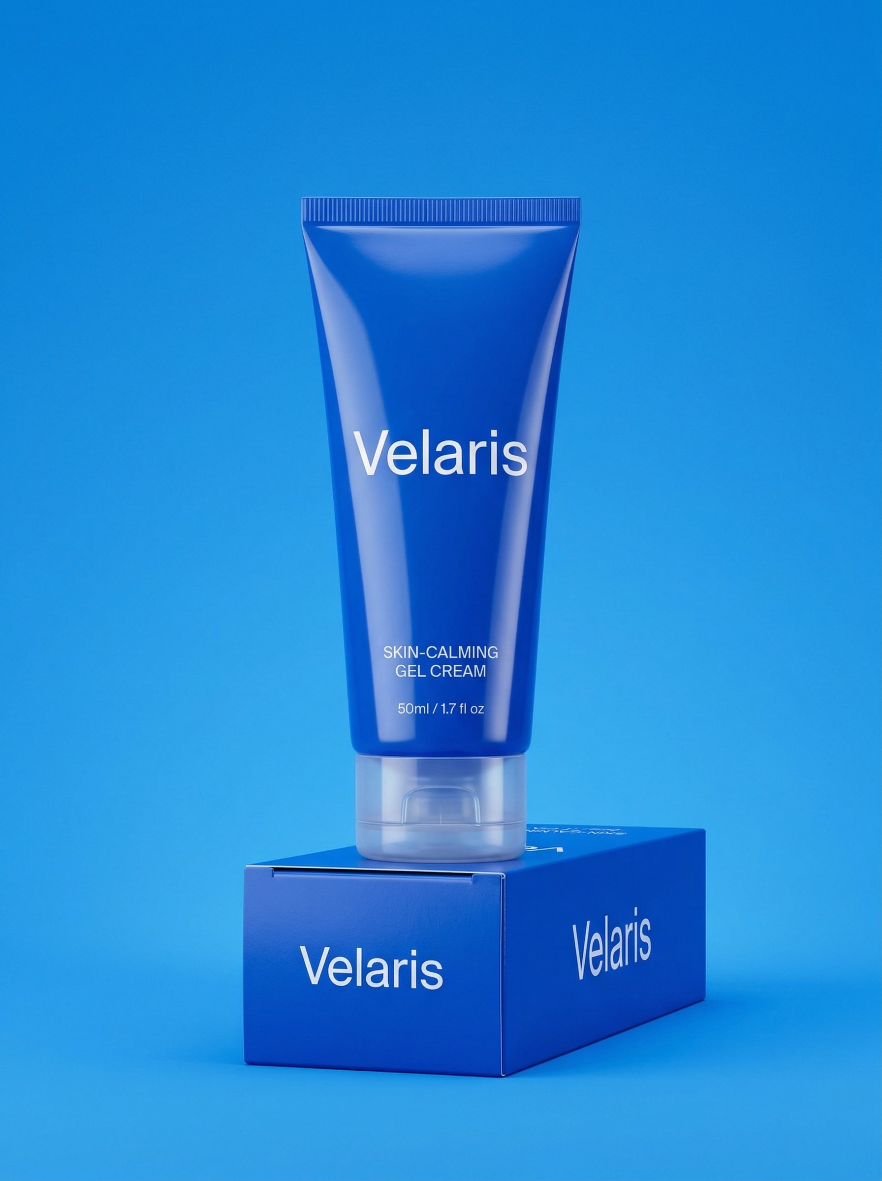
Monochrome skincare tube product shot
Monochrome skincare tube product shot builds a product-first visual for ecommerce, ads, catalog tests, and brand campaign imagery.
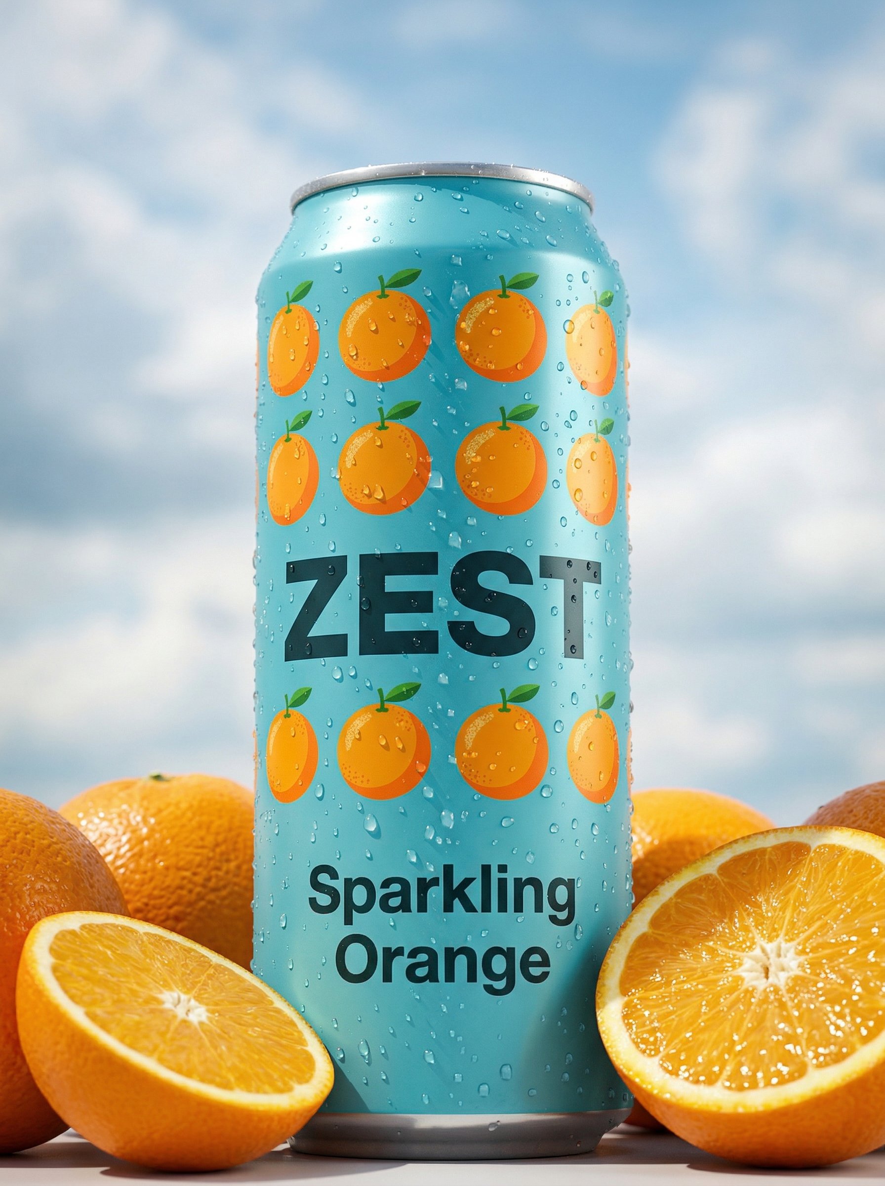
Citrus soda can product shot
Citrus soda can product shot builds a product-first visual for ecommerce, ads, catalog tests, and brand campaign imagery.
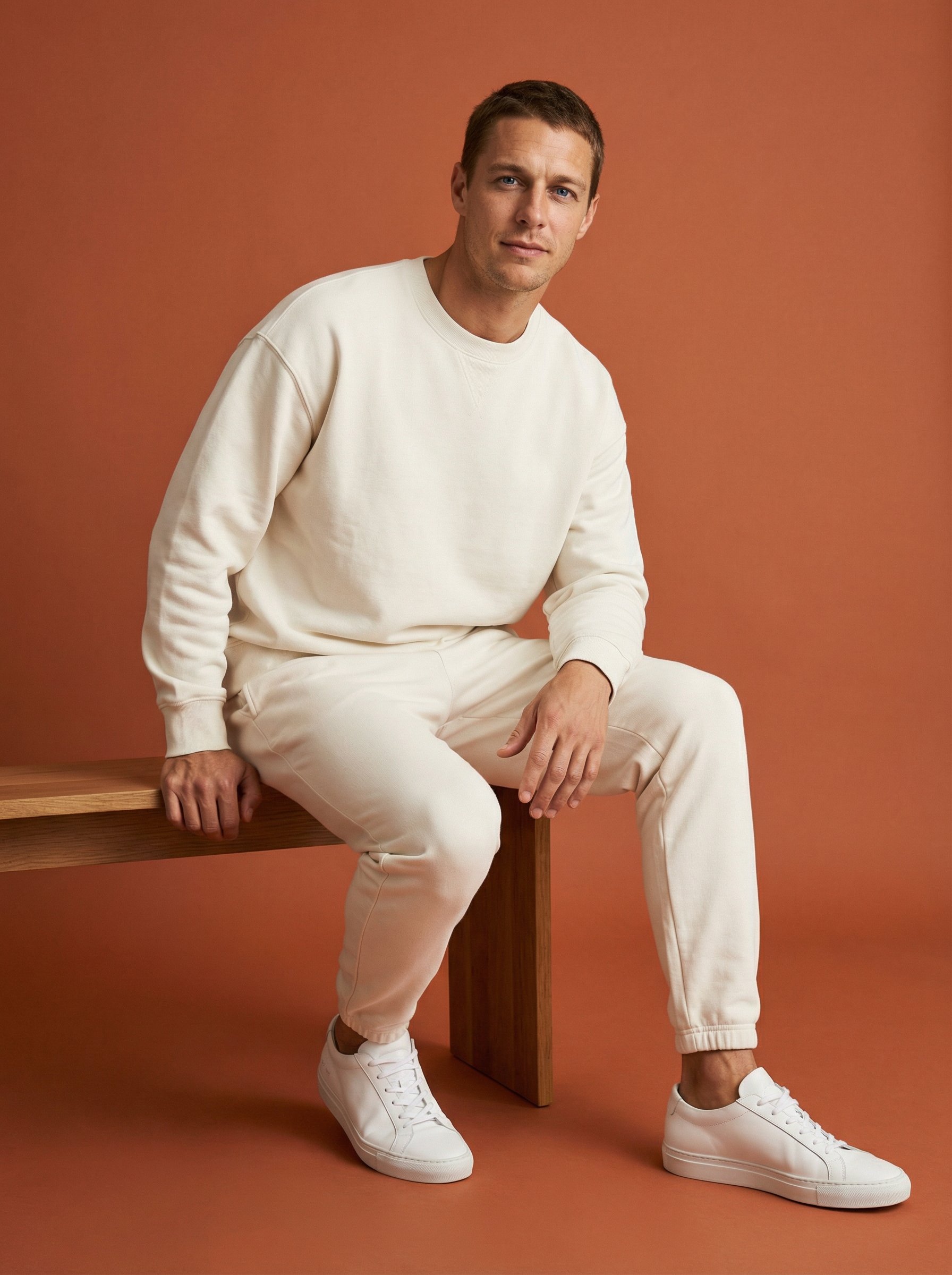
Terracotta lounge set fashion portrait
Terracotta lounge set fashion portrait explores a fashion or editorial portrait direction with stronger styling and campaign-ready composition.
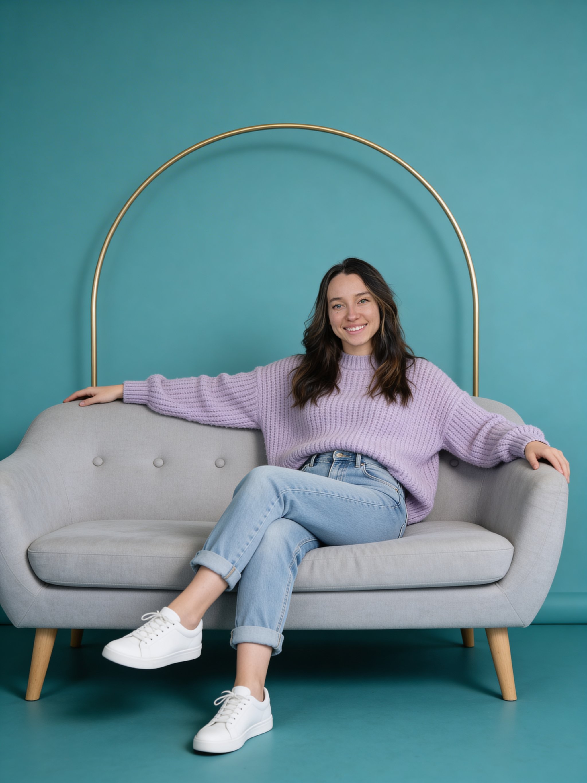
Lavender Sweater Teal Studio Portrait
Lavender Sweater Teal Studio Portrait creates a polished professional portrait for profiles, press kits, team pages, and business use.
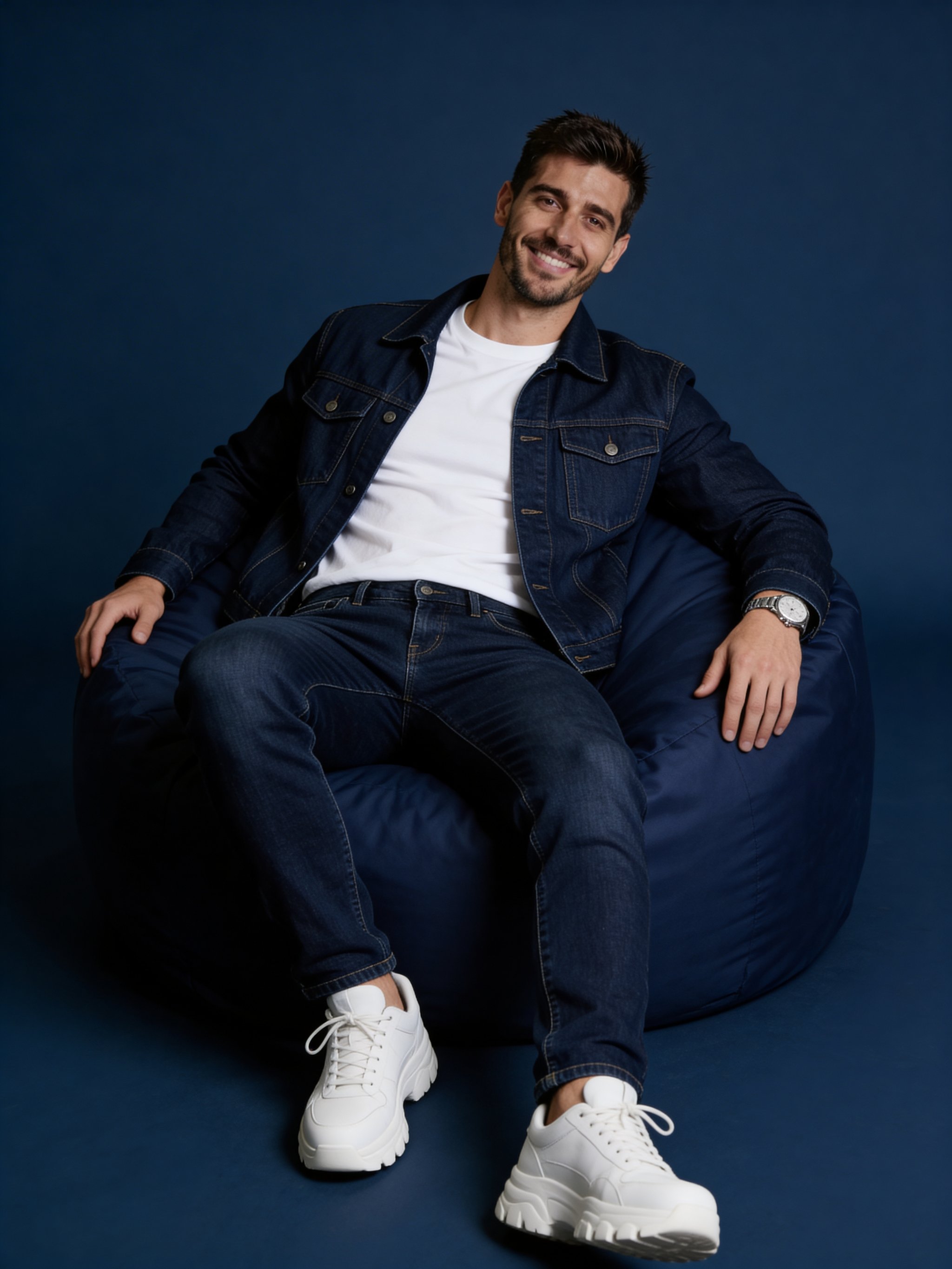
Monochrome navy studio fashion portrait
Monochrome navy studio fashion portrait focuses on a recognizable portrait result with clear subject presence and useful creative variations.
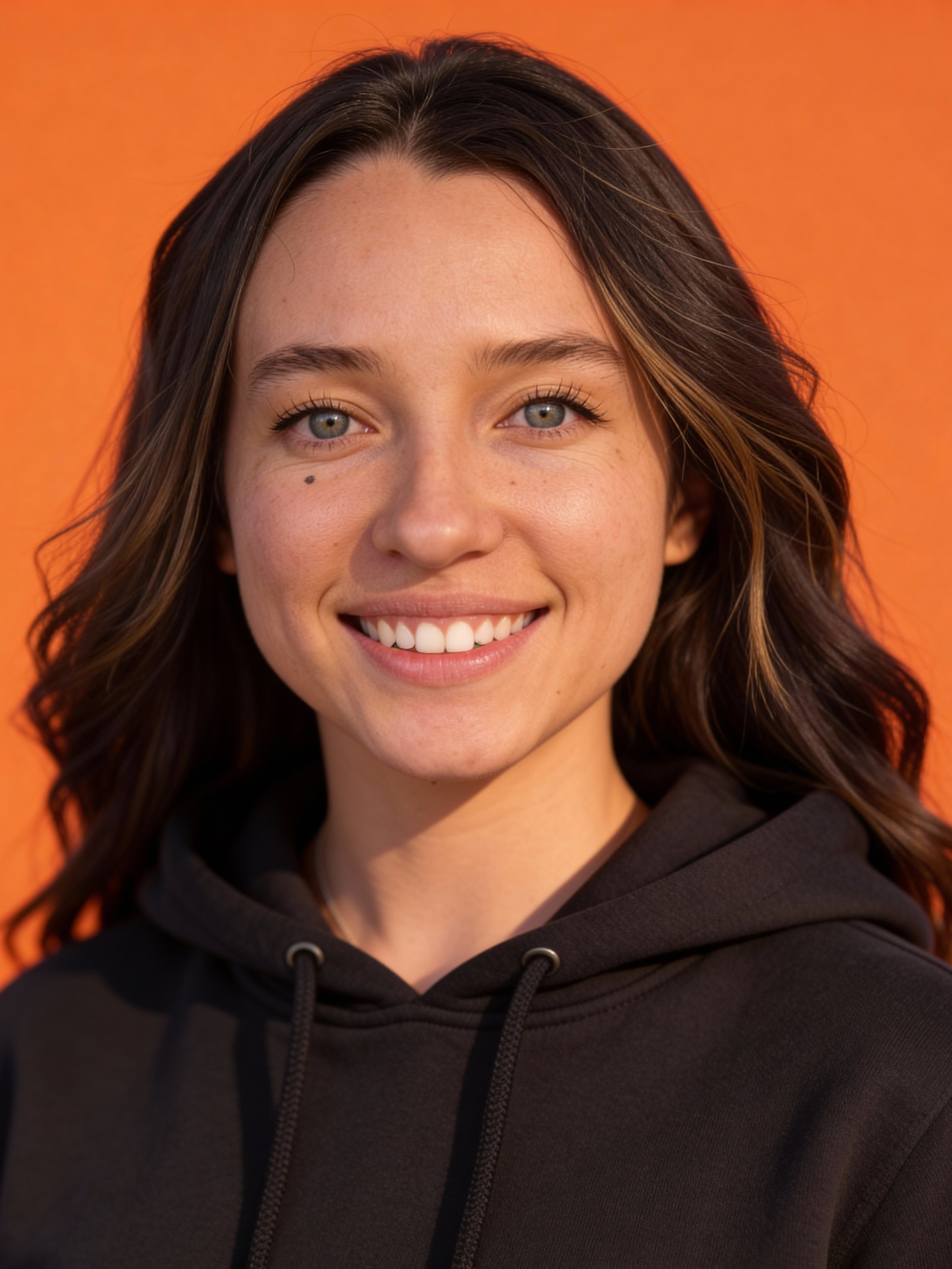
Orange studio headshot
Orange studio headshot creates a polished professional portrait for profiles, press kits, team pages, and business use.
Make it yours
Create with this recipe.
Open this recipe in the generator and add your details.
Generate a photo like this