Subject and likeness
Use 1 image and keep the defining subject details intact. Focus on this subject requirement: preserve facial structure, expression, and identity while translating the image into the art style.
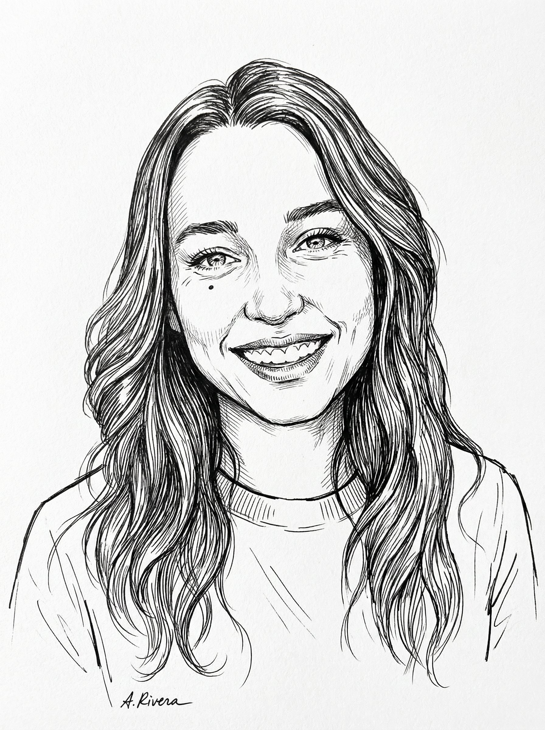
Create a Black Ink Sketch Portrait with a polished artistic treatment that preserves the subject while giving the image a clear illustrated style. Start from the reference image so the subject, source structure, or key visual details stay anchored while the style changes. This recipe is useful for profile pictures, editorial avatars, poster art, and stylized personal branding images.
Use this section to decide whether Black Ink Sketch Portrait is the right recipe before spending credits on variations.
Best for
Black Ink Sketch Portrait concepts where the example image is close to the result you want.
Not ideal for
Neutral photorealistic portraits with minimal visible styling.
Best for
Visual directions built around an art-led portrait treatment that keeps likeness readable while making the style expressive.
Not ideal for
Technical diagrams, product packshots, or plain background documentation.
Best for
Compositions that benefit from a visual setting that reinforces the artwork while leaving the portrait easy to read.
Not ideal for
Projects where every line must follow brand guidelines exactly.
Best for
Fast testing with Gemini 3 Pro Image in 3:4.
Not ideal for
Subtle face cleanup that should still look like an untouched camera photo.
Keep the core idea of Black Ink Sketch Portrait, then change the details that control identity, style, color, background, and framing.
Use 1 image and keep the defining subject details intact. Focus on this subject requirement: preserve facial structure, expression, and identity while translating the image into the art style.
Dial the style up or down while preserving this intent: an art-led portrait treatment that keeps likeness readable while making the style expressive.
Keep, limit, or replace the color direction while respecting this goal: expressive color that supports the art style while keeping the face and subject readable.
Use the background as a control surface: a visual setting that reinforces the artwork while leaving the portrait easy to read.
Start with 3:4. Then adjust the framing around this composition goal: compose for 3:4, keeping likeness, facial structure, and the artistic treatment balanced.
If Black Ink Sketch Portrait is close but not usable yet, make one of these targeted prompt edits before changing everything.
If the subject drifts, add a direct instruction to preserve facial structure, expression, and identity while translating the image into the art style.
Ask for fewer competing elements while preserving the intended style: an art-led portrait treatment that keeps likeness readable while making the style expressive.
Limit saturation, reduce competing colors, and keep the palette aligned with this goal: expressive color that supports the art style while keeping the face and subject readable.
Strengthen light direction, depth, and separation using this lighting goal: light and depth that shape the face without flattening the artistic treatment.
Use these as short alternate directions for Black Ink Sketch Portrait; each variant keeps the recipe recognizable while pushing a different outcome.
A cleaner Black Ink Sketch Portrait with fewer competing details, restrained color, and a simpler background.
A more campaign-ready Black Ink Sketch Portrait with stronger styling, clearer hierarchy, and more deliberate lighting.
A calmer Black Ink Sketch Portrait with softer contrast, gentler color, and a quieter background.
A refined Black Ink Sketch Portrait tuned for Gemini 3 Pro Image, composed for 3:4, and cleaned up for final use.
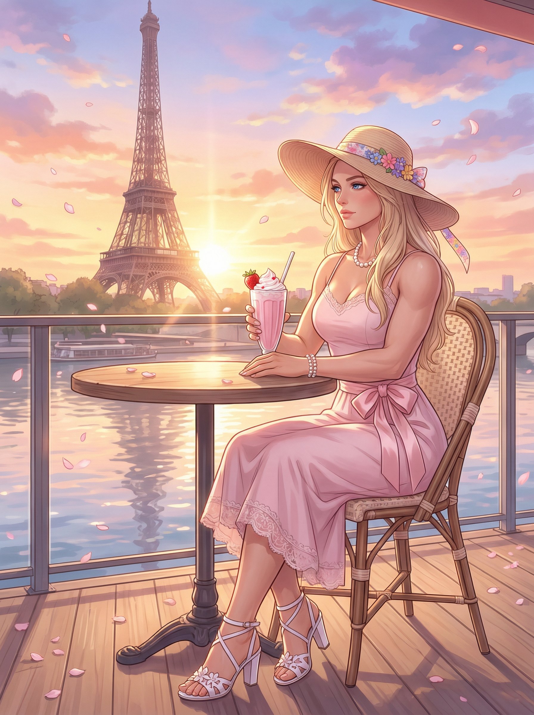
Paris Cafe Sunset Anime Illustration
Paris Cafe Sunset Anime Illustration uses a stylized art direction for portraits, avatars, posters, and expressive personal visuals.

Shirtless Comic Caricature Portrait
Shirtless Comic Caricature Portrait uses a stylized art direction for portraits, avatars, posters, and expressive personal visuals.
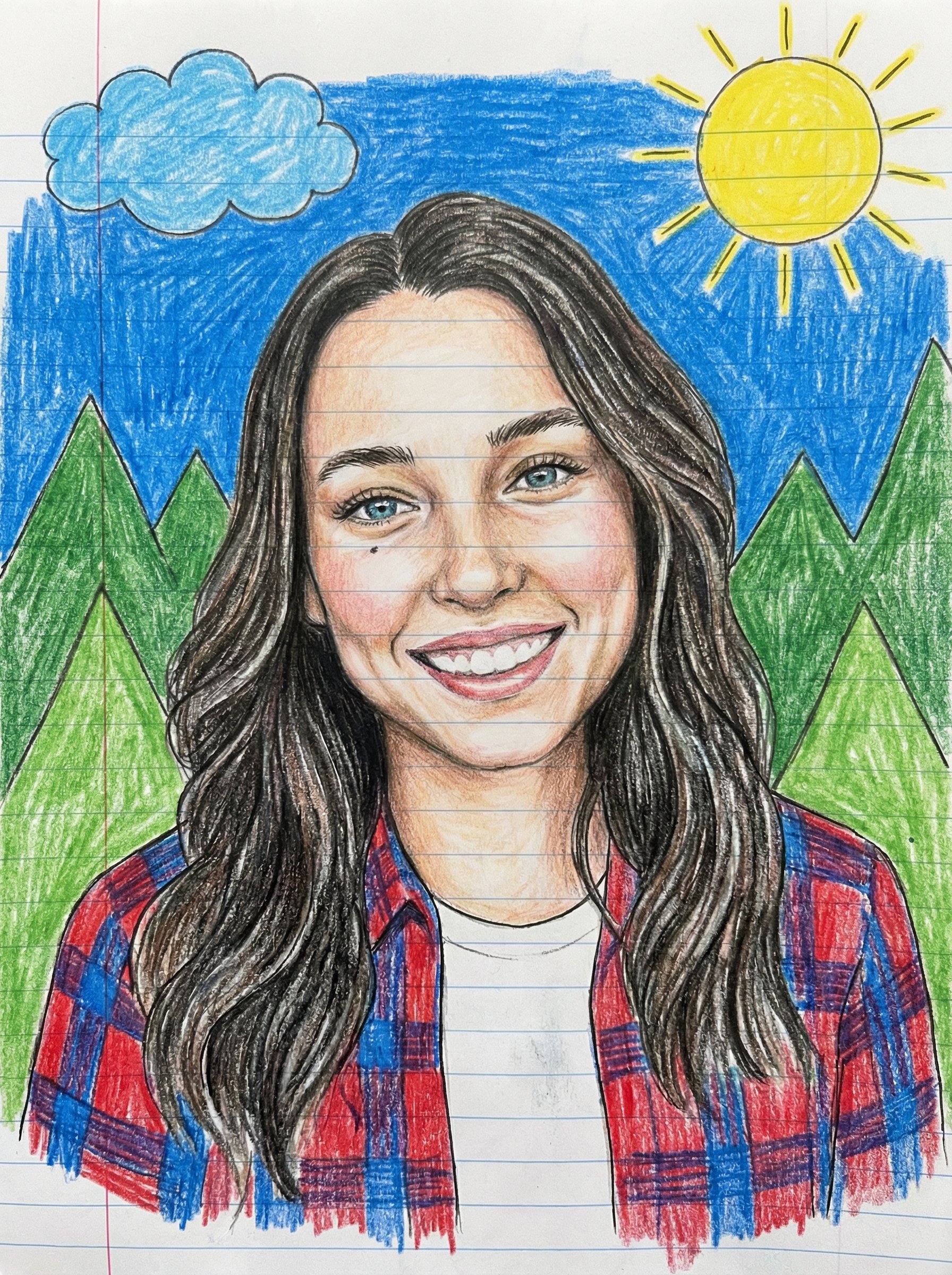
Childlike Colored Pencil Portrait
Childlike Colored Pencil Portrait uses a stylized art direction for portraits, avatars, posters, and expressive personal visuals.
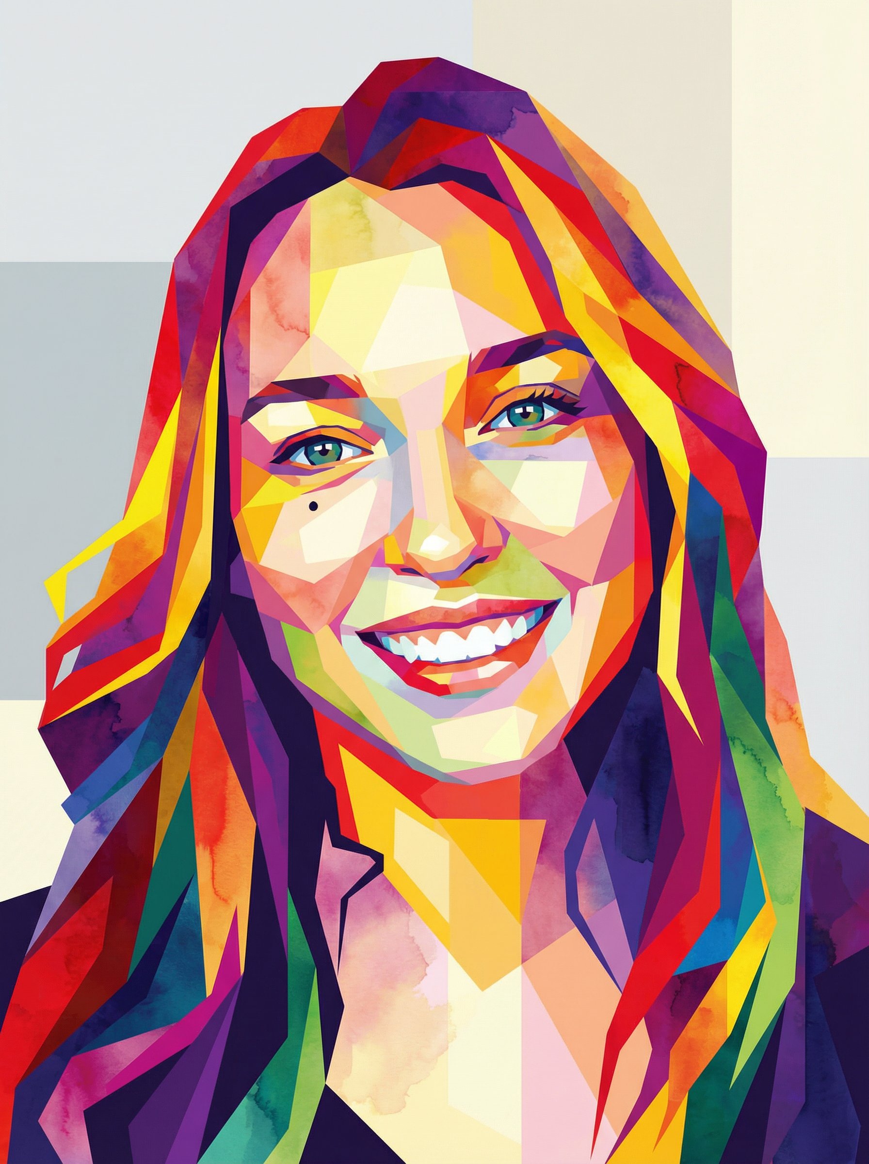
Abstract Geometric Polygon Portrait
Abstract Geometric Polygon Portrait uses a stylized art direction for portraits, avatars, posters, and expressive personal visuals.
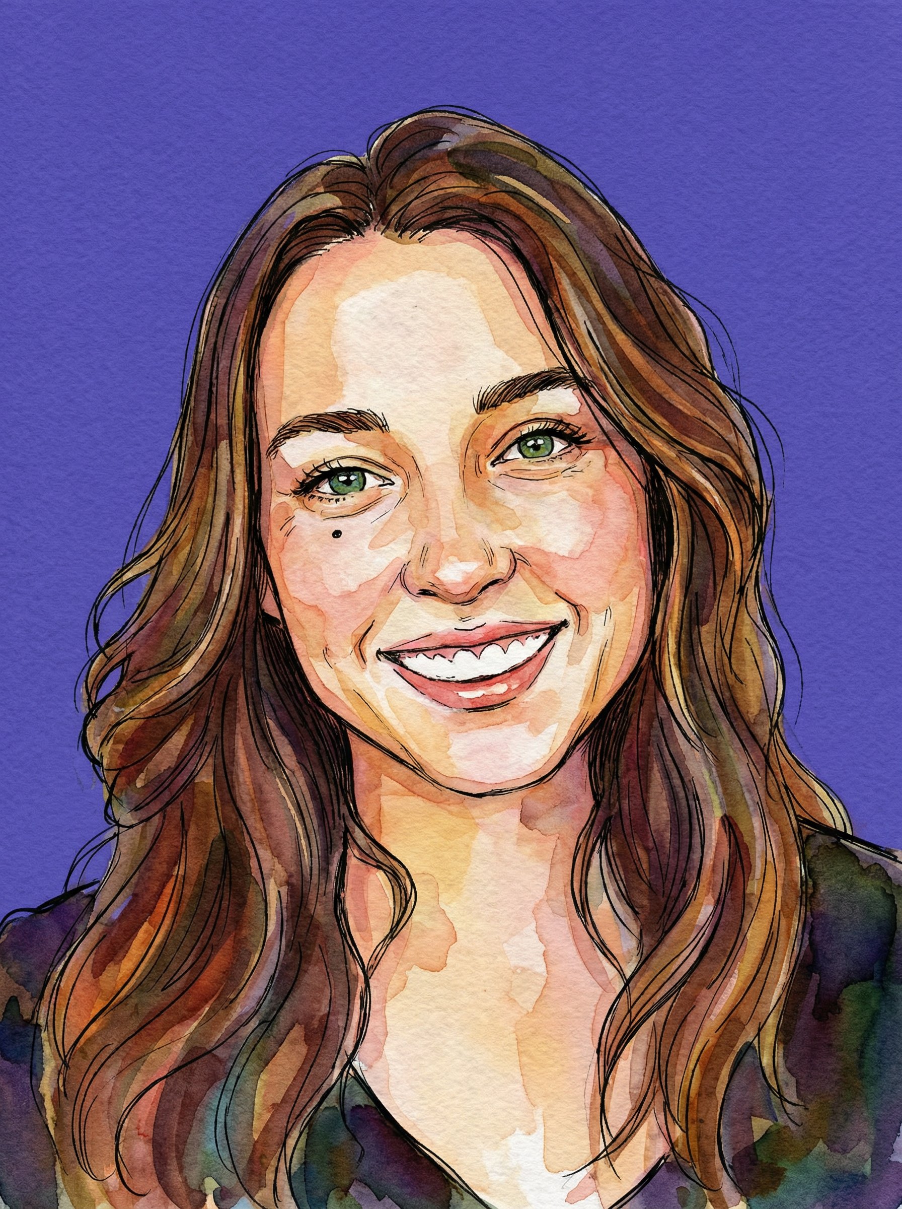
Watercolor Ink Purple Backdrop Portrait
Watercolor Ink Purple Backdrop Portrait uses a stylized art direction for portraits, avatars, posters, and expressive personal visuals.
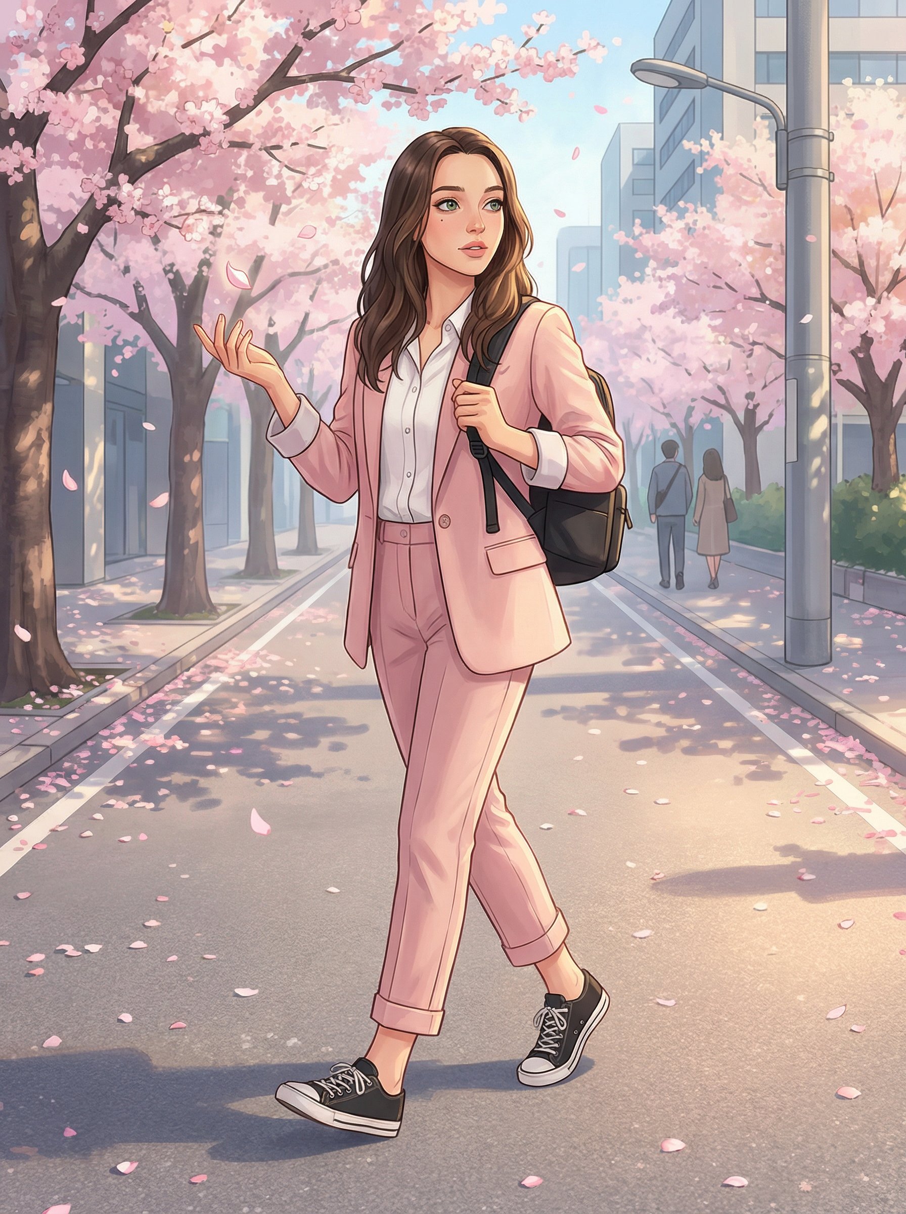
Cherry Blossom Anime Street Illustration
Cherry Blossom Anime Street Illustration uses a stylized art direction for portraits, avatars, posters, and expressive personal visuals.